Introduction to the Primary Colors
Light from the sun is composed of an almost continuous spectrum of electromagnetic radiation, with most of the energy being concentrated in wavelengths that lie between 220 and 3,200 nanometers in length. As they pass through the Earth's atmosphere, a majority of the light waves above 2,000 nanometers (infrared wavelengths) are absorbed by carbon dioxide, water vapor, and ozone so that most never reach the ground. The shorter ultraviolet waves are also absorbed by the ozone layer. This filtering effect of the atmosphere limits the spectrum of light waves reaching the ground to those having wavelengths between 320 and 2,000 nanometers.
The human eye is sensitive to a narrow band of electromagnetic radiation that lies in the wavelength range between 400 and 700 nanometers, commonly known as the visible light spectrum, which is the only source of color. When combined, all of the wavelengths present in visible light, about a third of the total spectral distribution that successfully passes through the Earth's atmosphere, form colorless white light that can be refracted and dispersed into its component colors by means of a prism. The colors red, green, and blue are classically considered the primary colors because they are fundamental to human vision.
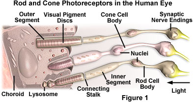
The eye contains cone cell photoreceptors (see Figure 1) embedded in the small central fovea of the retina that are tuned to respond to wavelengths distributed within these three regions (red, green, and blue) with specialized pigment proteins. All the colors of the visible light spectrum, ranging from violet to red, can be produced by adding or subtracting various combinations of the three primary colors. Light is perceived as white by humans when all three cone cell types are simultaneously stimulated by equal amounts of red, green, and blue light. Because the addition of these three colors yields white light, the colors red, green, and blue are termed the primary additive colors.
| Interactive Java Tutorial | |||||||||||
|
|||||||||||
When only one or two types of cone cells are stimulated, the range of perceived colors is limited. For example, if a narrow band of green light (540 to 550 nanometers) is used to stimulate all of the cone cells, only the ones containing green photoreceptors will respond to produce a sensation of seeing the color green. Human visual perception of non-primary additive colors, such as yellow, can arise in one of two ways. If the red and green cone cells are simultaneously stimulated with monochromatic yellow light having a wavelength of 580 nanometers, the cone cell receptors each respond almost equally because their absorption spectral overlap is approximately the same in this region of the visible light spectrum. The same color sensation can be achieved by stimulating the red and green cone cells individually with a mixture of distinct red and green wavelengths selected from regions of the receptor absorption spectra that do not have significant overlap. The result, in both cases, is simultaneous stimulation of red and green cone cells to produce a sensation of yellow color, even though the end is achieved by two different mechanisms. The ability to perceive other colors requires the stimulation of one, two, or all three types of cone cells to a varying degree with the appropriate wavelength palette.
If equal portions of green and blue light are added together, the resulting color is termed cyan. Likewise, equal portions of green and red light produce the color yellow, and equal portions of red and blue light yield the color magenta. The colors cyan, magenta, and yellow are commonly termed the complementary colors because each complements one of the primary colors in a white light mixture. Yellow (red plus green) is the complement of blue because when the two colors are added together white light is produced. Likewise, cyan (green plus blue) is the complement of red, and magenta (red plus blue) is the complement of green light.
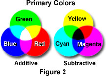
The complementary colors (cyan, yellow, and magenta) are also commonly referred to as the primary subtractive colors because each can be formed by subtracting one of the primary additives (red, green, and blue) from white light. For example, yellow light is observed when all blue light is removed from white light, magenta forms when green is removed, and cyan is produced when red is removed. The color observed by subtracting a primary color from white light results because the brain adds together the colors that are left to produce the respective complementary or subtractive color. Figure 2 illustrates overlapped color circles of both the additive and subtractive primary colors. The areas of overlap indicate the new colors that are produced by addition and subtraction of various combinations using these six primary colors, and also demonstrate how the additive and subtractive primaries complement each other.
When any two of the primary subtractive colors are added, they produce a primary additive color. As an example, adding magenta and cyan together produces the color blue, while adding yellow and magenta together produces red. In a similar manner, adding yellow and cyan produces green (see Figure 2). When all three primary subtractive colors are added, the three primary additive colors are removed from white light leaving black (the absence of any color). White cannot be produced by any combination of the primary subtractive colors, which is the main reason that no mixture of colored paints or inks can be used to print white.
| Interactive Java Tutorial | |||||||||||
|
|||||||||||
A good example of color addition and subtraction are the variations observed in sunlight color as the sun rises, passes overhead, and then sets. The color of sunlight changes as it passes through the Earth's atmosphere because collision of photons with the varying densities of air molecules removes some of the colors. When the sun is high in the sky in the late morning and early afternoon, the light appears to be yellow. As the sun approaches the horizon, the light must travel through a larger portion of the atmosphere and begins to turn orange and then red. This occurs because the air absorbs an increasing amount of blue light from the sun, leaving only the longer wavelengths in the red region of the visible light spectrum.
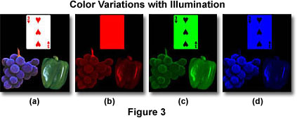
The series of photographs presented in Figure 3 contain images of a playing card (the 3 of hearts), a green bell pepper, and a cluster of bluish-purple grapes superimposed on a black background. In the photograph on the left (Figure 3(a)), the three objects are illuminated with white light and appear as we expect them to appear under natural lighting. In the second photograph (Figure 3(b)), the objects are illuminated with red light. Note that the playing card is reflecting all of the red light that strikes it, while only the grape stem and white highlights on the grapes and pepper reflect red light. The majority of red light impacting on the grapes and pepper is being absorbed.
The third photograph of the series (Figure 3(c)) presents the objects under illumination with green light. The symbols on the playing card are now black and the body of the card is reflecting green light. The grapes are reflecting some green light, while the pepper appears normal (but with green highlights). The fourth photograph (Figure 3(d)) illustrates the objects under blue illumination. The grape cluster appears normal with blue highlights, but the stem has turned black and is now invisible. The playing card is reflecting blue light with black symbols and the pepper is reflecting blue light only on the highlights. This series of images demonstrates how an object that looks red (for example, in white light) absorbs blue and green wavelengths, but reflects wavelengths in the red region of the spectrum. Therefore the object is seen as red.
| Interactive Java Tutorial | |||||||||||
|
|||||||||||
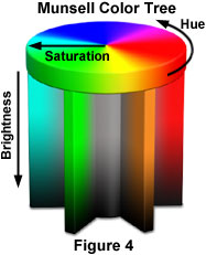
The human eye is sensitive to very slight differences in color and is probably capable of distinguishing between 8-12 million individual shades of color. Most colors contain some proportion of all wavelengths in the visible spectrum. What really varies from color to color is the distribution of wavelengths in a given color. The predominant wavelength palette determines the basic hue of the color which can be, for example, purple, teal, beige, pink or orange. The ratio of the dominant wavelengths to other wavelengths determines the color saturation of the sample and whether it appears pale or deeply saturated. The intensity of the color and reflectivity of the object being imaged determine the brightness of the color (for example, dark or light blue). This is nicely illustrated below in the Munsell Color Tree, where each color is represented by a distinct position on the tree (see Figure 4). Hue color value is represented by placement on the circumference, saturation by the horizontal distance of the color from the central axis, and brightness by the vertical position on the trunk.
Much of this discussion has centered on the properties of visible light with respect to the addition and subtraction of transmitted visible light that can be visualized on the screen of a computer or television. Most of what is actually observed, however, is light that is reflected from objects around us, such as other individuals, buildings, automobiles, landscapes, etc. These objects do not produce light themselves, but emit color by a process known as color subtraction where certain wavelengths of light are subtracted (absorbed) and others are reflected (as illustrated in Figure 3). For example, a green leaf appears this color under natural sunlight because it is reflecting green wavelengths and absorbing all of the other colors. The hue, brightness, and color saturation of the reflected green light is determined by the exact spectrum of wavelengths that are reflected.
Pigments and dyes are responsible for most of the color we see in the real world. Eyes, skin, and hair contain natural protein pigments that reflect the colors visualized in the people around us (in addition to any assistance by colors used in facial makeup and hair dyes). Books, magazines, signs, and billboards are printed with colored inks that create colors through the process of color subtraction. In a similar manner, automobiles, airplanes, houses, and other buildings are coated with paints containing a variety of pigments. The concept of color subtraction, as discussed above, is responsible for most of the color produced by the objects just described. For many years, artists and printers have searched for substances containing dyes and pigments that are particularly good at subtracting specific colors.
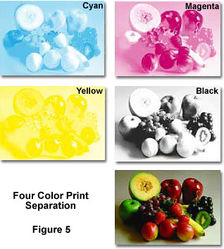
All color photographs, and other images that are painted or printed, are produced using just four colored inks or dyes--magenta, cyan, yellow (the subtractive primaries) and black (see Figure 5). Mixing inks or dyes having these colors in varying proportions can produce the colors necessary to reproduce just about any image or color. The three subtractive primaries could (in theory) be used alone, however the limitations of most dyes and pigments makes it necessary to add black to achieve true color tones. When an image is being prepared for printing in a book or magazine, it is first separated into the component subtractive primaries, either photographically or with a computer as illustrated above in Figure 5. Each separated component is made into a film that is used to prepare a printing plate for that color. The final image is created by sequentially printing each color plate, one on top of another, using the appropriate ink to form a composite that recreates the appearance of the original. Paint is also produced in a somewhat similar manner. Base pigments containing the subtractive primaries are mixed together to form the various colors used in final paint preparations.
This discussion has covered the various aspects of the primary additive and subtractive colors. In using the microscope to view and capture color images, the concepts of additive and subtractive primary colors are very important. Microscope light sources are usually tungsten-halogen bulbs that can emit a bright light with a color temperature centered around 3200 K, or arc lamps for fluorescence microscopy that produce a color temperature in the 5500 K range. To the observer, these appear as white light that can be absorbed, refracted, reflected, polarized, and/or transmitted by a specimen on the microscope stage. The rules of primary colors apply to how the specimen interacts with microscope light and determines what colors are displayed as the sample is visualized in the eyepieces. These rules also apply to the film in a traditional camera system or a digital imaging device attached to the microscope, both of which depend upon the interrelationships between primary colors to capture images.
Contributing Authors
Kenneth R. Spring - Scientific Consultant, Lusby, Maryland, 20657.
Michael W. Davidson - National High Magnetic Field Laboratory, 1800 East Paul Dirac Dr., The Florida State University, Tallahassee, Florida, 32310.
